junge Bühne Spielzeitheft
Digital brochure for educational theatre offers
- Role: designer
- Stakeholder: Theater neue Bühne Senftenberg
- Sectors: arts & culture
- Deliverables: accessible pdf of season brochure and animated gif for digital marketing use
German theatre neue Bühne Senftenberg offers arts & culture-based activities and a large repertoire for educational and community groups. These 'junge Bühne' offers are promoted in a seasonal brochure that is specifically aimed at teachers and group leaders.
You can play all animations here.
- Accessibility
- Animation
- Design
- Illustration
Based on previously collected feedback from teachers, the theatre was planning to change the printed brochure to a digital format that had to be interactive and accessible.
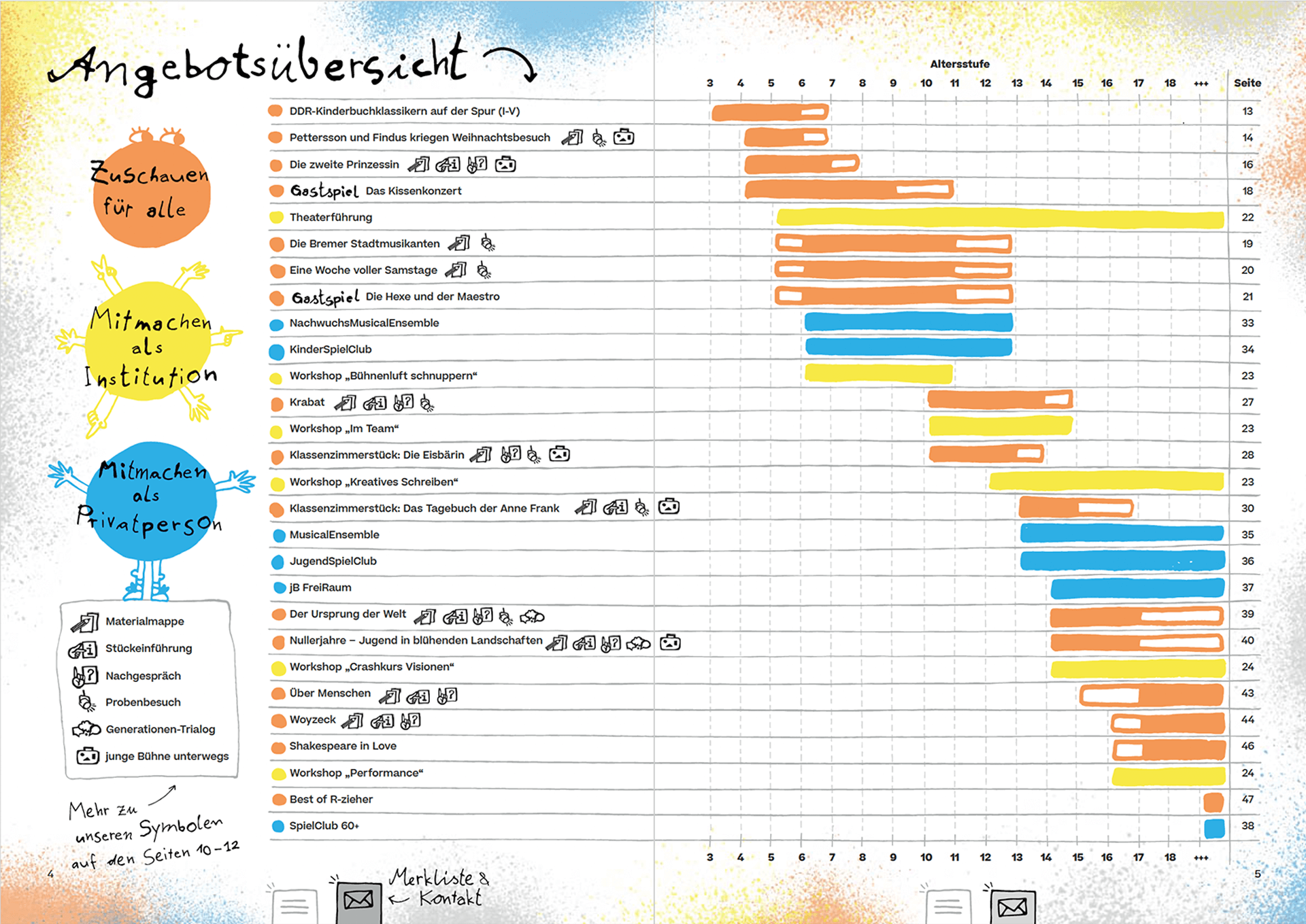
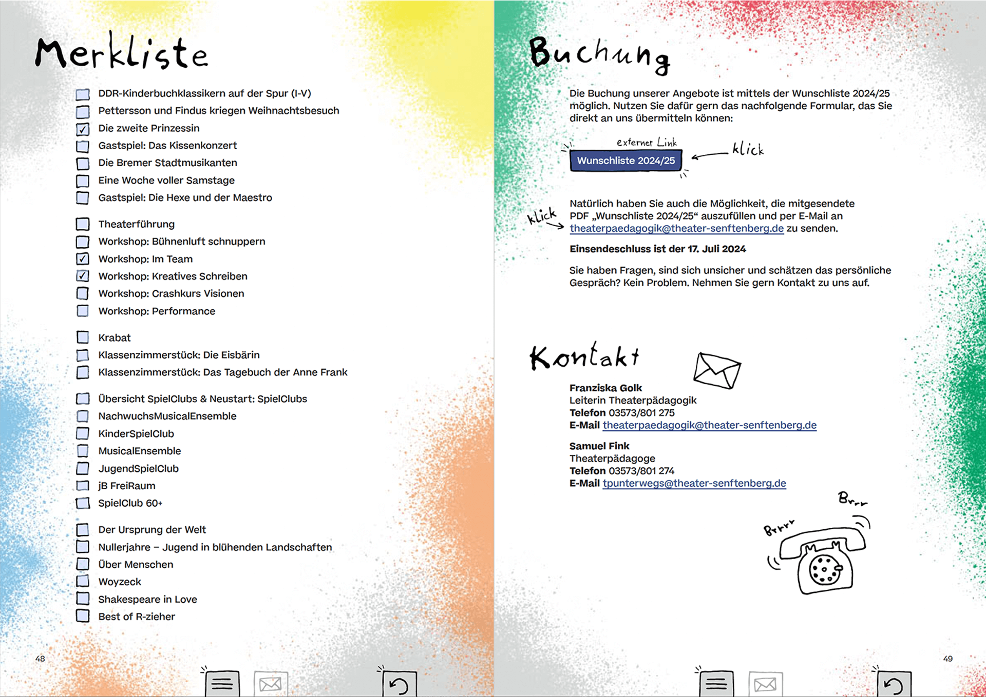
Working closely with the theatre's Education and Marketing Teams, I developed a clickable pdf that was both visually on brand and as accessible as possible within the pdf format restraints.
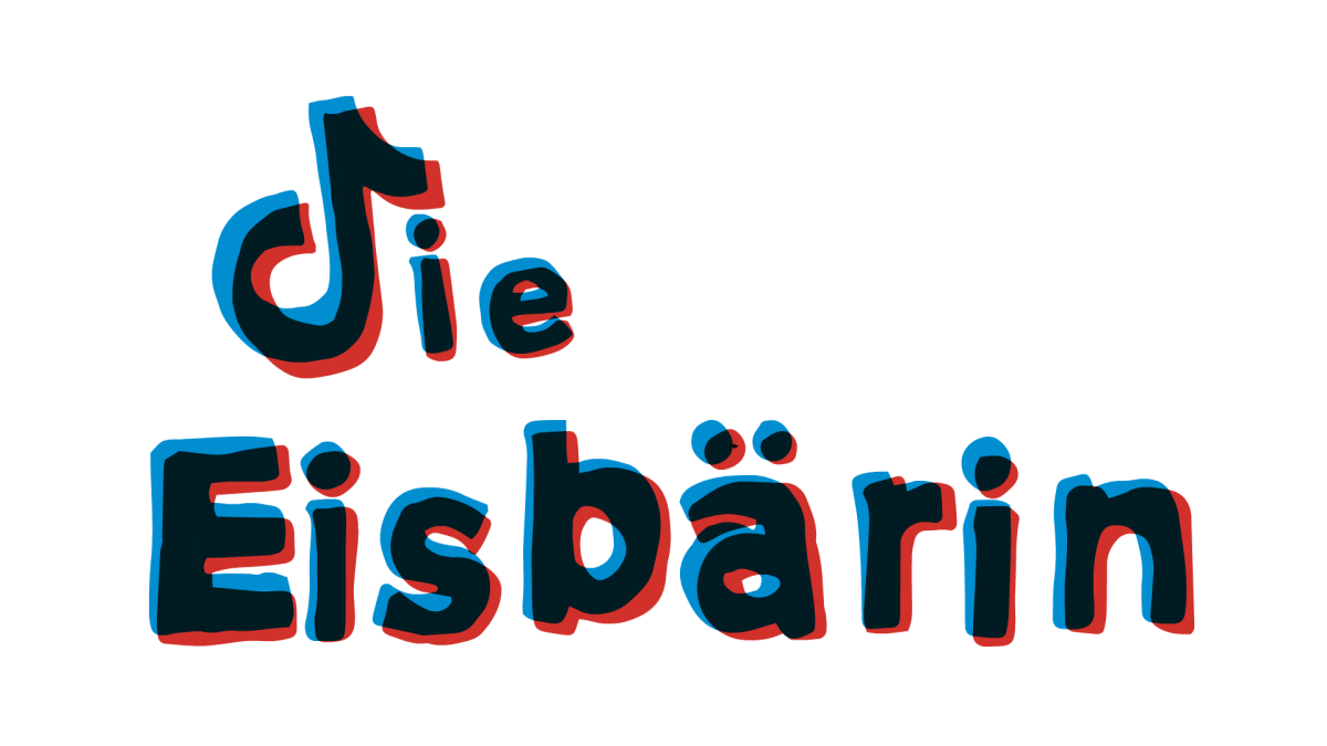
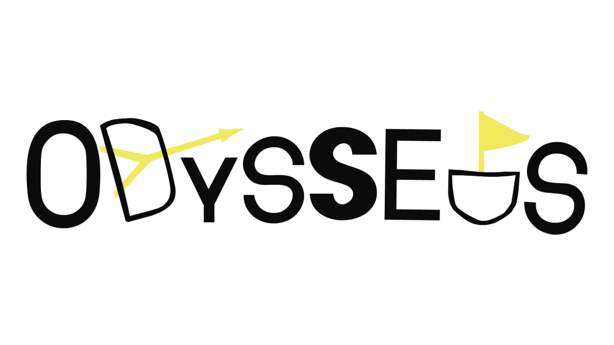
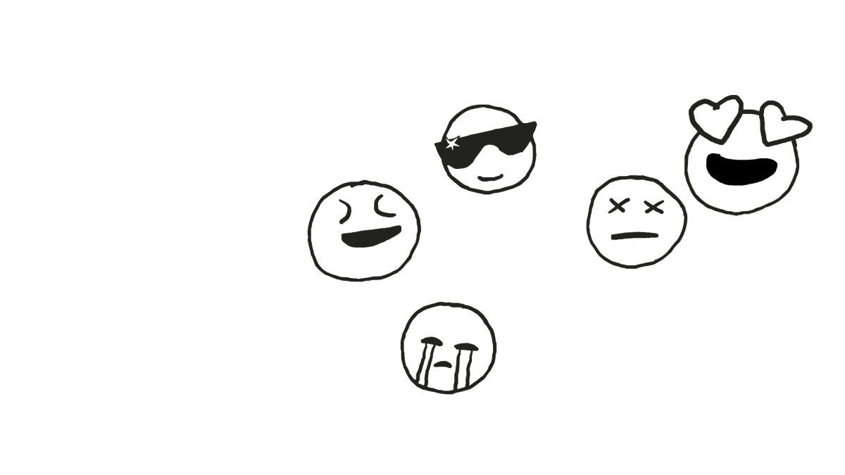
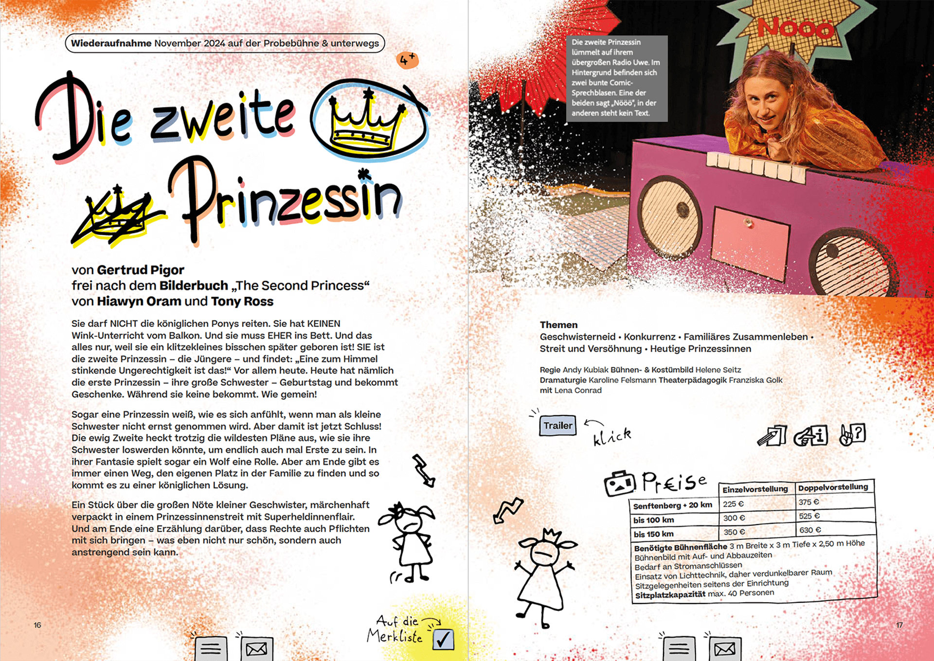
I drew a variation of letters and doodles and combined them with characterful display fonts to sit alongside the provided brand fonts and colours. This combination produced a ‘cheekified’ digital notebook version of the more traditional printed seasonal brochure.
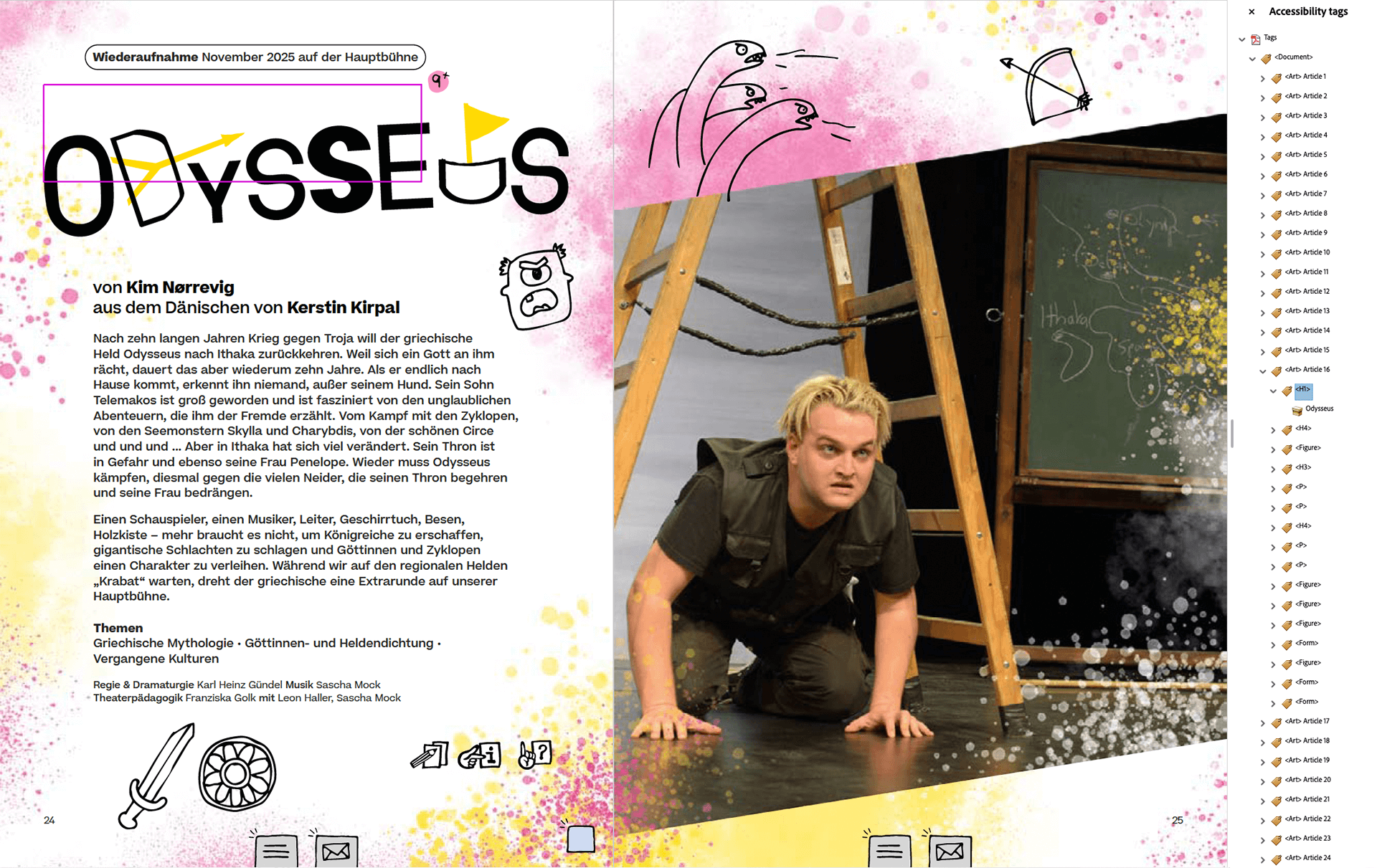
To ensure optimal ease-of-use I added menus, marked links and a checklist. Underneath the doodle layer the main document structure is built on a logical reading order with clearly tagged headlines, tables and text blocks. All relevant images have alternative text added and all decorative content is artefacted. The colourful background layer is added as a watermark and not printed if a user decides to print out any of the pages.
We shared a first draft of the document with a small focus group, and iterated the brochure based on the feedback we received. The finished brochure has been very well received for its visual style and its help in improving the group booking process.
To help promote the new season I roughly animated the titles and doodles of each featured play to be used on the theatre's social channels.